It’s fair to say that the Pareto Chart (or Pareto Analysis) is the most popular technique used to interpret the data on the basic level. It’s simple and easy to follow graphical representation of results. If you have not heard about it then, believe me, you are missing a lot. Today I will share with you the basic principles of Pareto Analysis. I will focus on the practical part of it so you can make the best of it in your next improvement project.
What’s so unique about Pareto Analysis?
Pareto Analysis follows the simple rule that 80% of all issues are caused by only 20% of contributing factors. In other words, if you rectify 20% of causes, then 80% of problems should go away. That’s the theory 😉
In practice, Pareto Analysis depends heavily on the data that is available. Therefore it is far more critical to ensure data integrity than jumping straight into plotting Pareto Chart.
You can read more about data collection here:
http://www.quality2day.com/3-steps-to-your-success-in-continuous-improvement/
Remember to use common sense though.
It doesn’t always have to be ideal 80% to 20% split.
How to approach Pareto Analysis?
Before you start the analysis make sure the following has been taken care of:
- Relevant data has been collected
- The scope of the study has been agreed
To be perfectly honest if you have done the above than the rest is just a walk through the park. In the old days, things were slightly more complicated as graph paper and pencil were the only tools to get this done. Today you can quickly draw a chart using a spreadsheet.
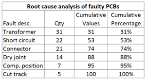
In the example below, we are analysing the root cause of product failure based on one month of customer complaints.

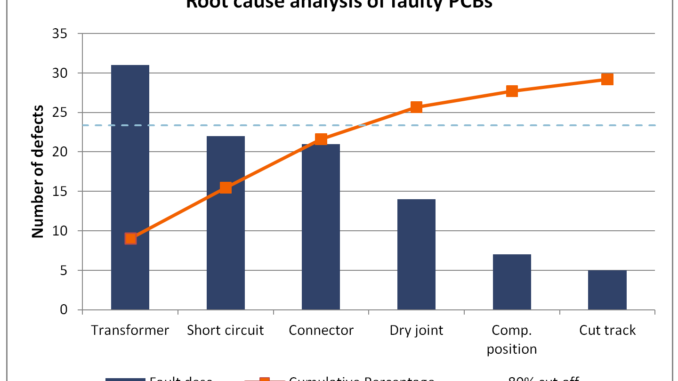
Once you have all the data in the spreadsheet, you can present findings using a graph.

You can download a FREE Pareto Analysis Template from the PREMIUM LIBRARY. Click on the icon below and get your copy.
Are we there yet?
We have not finished quite yet. You have your data beautifully presented on the chart, and now it’s time to start working on the improvement. But is it? What about the financial aspect of the analysis? Many of us can forget about it while carried away buy good results of Pareto Analysis. So next time before you kick off with the next project take a step back and add financial values to the analysis. Are you still going with the project of your choice or is it time to re-evaluate?
The financial impact should be taken into account as part of Pareto Analysis.
When we did an initial analysis of the root cause earlier in this post, defective transformers were the biggest offender. Therefore next step should be to focus on those.
However, the result is different if you take into account the cost associated with each type of failure. See the comparison below.

Pareto Analysis can be carried out using four different points of reference:
- Quantity (frequency)
- Cost
- Time
- Severity
Make sure your results of Pareto Analysis are relevant in the context of current business needs.


22 Comments
Leave your reply.